This company’s logo is an example of gestalt perception. The earthy colors demonstrate the Similarity Principle. The Proximity Principle is demonstrated as each letter connects visually to create the image of eating. Continuation is present as the eye is guided from each colored letter to another. The Figure/Ground Principle is the most outstanding, as the white background forms a spoon and food by using the white background to form a picture.

Monthly Archives: March 2013
Mallory Bailey: Post No. 3

This Hangout Poster illustrates the gestalt principles of closure, figure-ground, and continuation. The use of closure occurs with the line designs within the guitar. Some of them run off the guitar into the blue background. Your eye continues to follow them as they run off the focal object. Figure-ground occurs within the entire poster. The dramatic change from yellow to blue illustrates this. Continuation occurs as the eye follow from the hand down to the white type at the very bottom. Readers will naturally read from top to bottom just like they would left to right.
Chris Herrington Post No. 3

This photo shows many Gestalt Principles that are immediately clear upon viewing. The first would clearly be similarity. The circles and squares similar to one another make the viewer group them naturally based upon their similarity into a pattern. It also contains proximity, considering the circles are placed closely together, and the squares are placed closely together. Finally it contains figure and ground, the eye naturally forms a cross from the squares making it the figure, and the circles the ground.
Anna Kate Craig: Post No. 3
![]()
The Adobe logo shows three different uses of the Gestalt principles.
1. The first would be closure because the red and white image is not necessarily apparent, but consumers are able to recognize that it is an A. Our eyes are able to fill in what is missing from the symbol to complete the image.
2. It also shows some continuation due to the fact that the bottom is not filled in or cut off. Your eye is led down to the open space in which Adobe is very apparent and visible in black.
3. A third use of the Gestalt Principle would be figure and ground. Since Adobe starts with an A, we can see that the white space which forms the A would be the figure leaving the red space to be background to the image.
Jessey Jones: Post No. 3

This article/picture shows a few of Gestalt’s principles. Three of the principles that stood out to me were continuation, figure/ground. and similarity in color. As you look at the picture, the black and white lines automatically lead the eye to the bottom of the page, where the article is located. That is a great example of continuation. The second principle I noticed is figure/ground. The black and white lines also make up the outline of the purse. The third principle i noticed was similarity in color. There is a pattern in the color of the lines. This allows the eye to follow the lines all the way down. The pattern in the lines allows the eye to focus, where if the lines were different sizes and too many different colors, the eyes would not know where to look. They also continued with the similarity in color by using only black and white in the area of the article. The picture is also black and white, which adds to the look.
Hannah Whitten: Post No. 3

The NBC logo is an excellent example of some of Gestalt’s principles. Similarity is the first one that I noticed. All of the feathers of the peacock are very similar in shape and size. Another principle that I see is proximity. All of the shapes fit together in a close proximity to make the figure of the peacock stand out. Figure is definitely a principle seen in this logo. The figure of a peacock stands out around the white space. Through the use of Gestalt’s principles, this logo works really well.
Tyler Aberg Post No. 3
![]()
Closure: The logo is not completely close. The right hand side of the logo is open ended.
Proximity: The 3/4 closed circle draws the readers eye into the center of the logo. Therefore, they see the big BL and automatically they know this is Bud Light even before their eye moves down to read the actual word.
Figure Ground: There is clear figure/ground between the 3/4 circle and the large BL. There is enough white space for the eye to rest. It also makes the BL stand out. The thickness of the line(s) around the BL change which give the appearance of it being in the background.
Martin Powell: Post No. 3
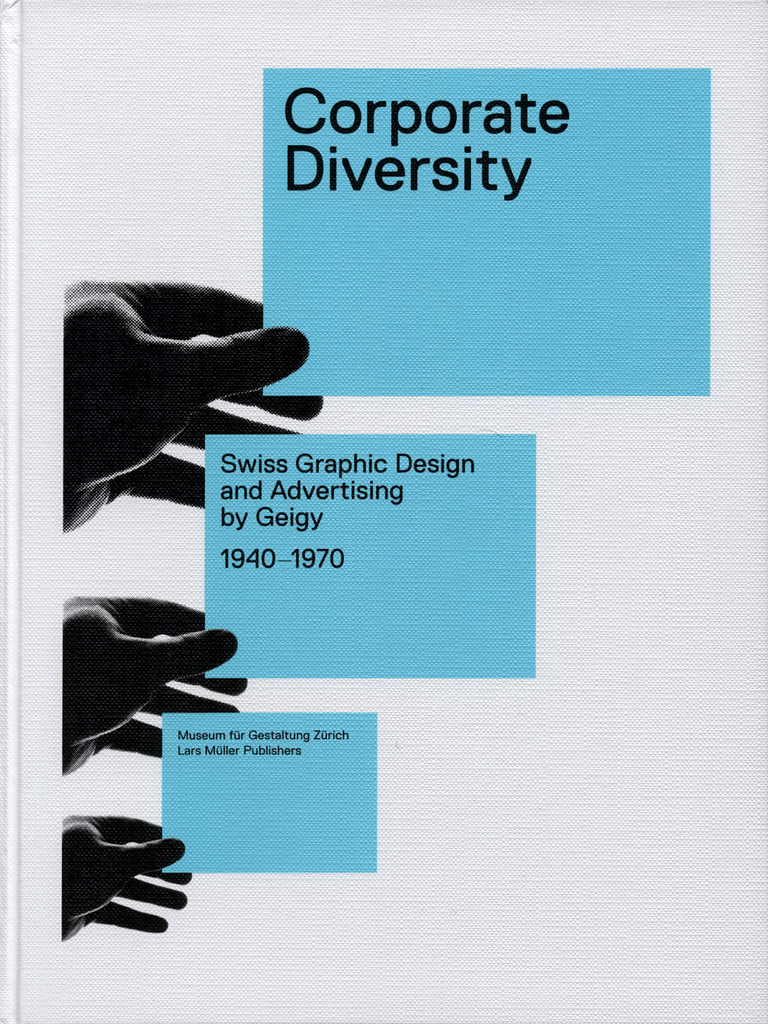
This poster for a Swiss designer’s showcase uses the Gestalt principles in perfect conjunction. The most immediately striking of these principles is that of color. As the viewer first looks at the poster, his or her eye’s are immediately attracted to the largest splash of the vibrant blue, which forces the viewer to read the headline. Next, the principle of proximity leads the viewers eyes to the left, as the viewer cannot help but notice the overlap of the black hand and color. From their, again the color takes over and causes the viewer to read the next line, and this process reoccurs for a third time. The blending of these ideas of color and proximity result in the third Gestalt principle at work, continuity. The first two principles seamlessly integrate to create a continuous path, leading the viewers eyes down the page and helping them gather all of the information. This poster is a great example of the application of Gestalt principles.
Molly Rhoades: Post No. 3
![]()
1. Closure-The middle image of the logo creates a queen or mermaid like figure. However, it is not a fully enclosed image. The eye must create the image by putting all the pieces together
2. Proximity-the various lines within the starbucks logo create an illusion of connectivity, and as one whole group because they are placed so close together.
3. Continuity-The starbucks logo is shaped within a circle. However, in the middle are two stars that stand out from the rest of the circle. This grabs the readers eye and forces them to continue on to the next part of the “starbucks coffee” sign
Lauren Raphael: Post No. 3
![]()
Gestalt is known as the “Law of Simplicity” which the Coca- Cola logo represents. The color is one consistent throughout the entire logo. Also one of his principles is similarity. The typeface is the same in the entire logo. Also the way the C’s have the long tail and highlight the rest of the letters is similarly done. Continuation is anther principle. The way the C’s are elongated and highlight the rest of the letters gives the illusion to your eye to travel across the word. Your eye is tricked by the long tails too scan across the word from right to left.
