Blog Post #5

This week we are giving you a break. Upload a jpeg of your magazine project and explain the voice and target market of your brand new magazine. What current magazine is your competition and how you’ve differentiated your magazine from the competition. Is it perfect bound or saddle stitched. Is it subscription or newsstand sales based. Explain how you amplified the content of the print article you designed through color, typography and images on the opening and jump spread. All this information should also be on your rationale.

This post is due Wednesday April 10th by 11:59 pm.

Blog Post #4

Go to a bookstore and take a picture of the magazine cover you liked the most and explain why. Do you think its sales base is newsstand or subscription and why Which coverline was the best at getting you to open the magazine and why. Is it a weekly, monthly, quarterly? What’s the date on the magazine? How much is it?

Deadline for this post is pushed to Friday March 29th at 11:59 p.m.

Blog Post #3

Show an example (do not copy another student’s post) of something in print, web, on a package, on a billboard, on a sign, etc, and explain three gestalt principles being used in the piece and how well it works.

This is due Wednesday at 11:59 p.m.

Blog Post #1

Take six pictures from around Oxford (no internet pictures), three signs, two magazines, one newspaper using…

… a Modern Serif Typeface
… a Sans Serif Typeface
… a Slab Serif Typeface
… a Blackletter Typeface
… a Script Typeface
… a Novelty Typeface

Post them to the blog and explain how each typeface works or doesn’t work with the personality of the organization.

Post is due Wednesday February 6th by 11:59pm. 

Blog Post 1

First Blog Assignment: Take six pictures from around Oxford (no internet pictures), three signs, two magazines, one newspaper using…

… a Modern Serif Typeface
… a Sans Serif Typeface
… a Slab Serif Typeface
… a Blackletter Typeface
… a Script Typeface
… a Novelty Typeface

Post them to the blog and explain how each typeface works or doesn’t work with the personality of the organization.

**Be sure to follow directions so you get full credit.  Do not forget to label your posts correctly.  (i.e.. Natalie Moore: Post No. 1)

***This post is due Wednesday, February 6th at 11:59 pm

Post 1

First Blog Assignment:

Take six pictures from around Oxford (no internet pictures), three signs, two magazines, one newspaper using…

… a Modern Serif Typeface
… a Sans Serif Typeface
… a Slab Serif Typeface
… a Blackletter Typeface
… a Script Typeface
… a Novelty Typeface

Post them to the blog and explain how each typeface works or doesn’t work with the personality of the organization.

*** Remember***

Label your post  “Your First & Last Name- Post #”

Post by Wednesday February 6 at 11:59

Pitch: Multi-Media Story #2

The food industry is huge in Memphis, TN. Nobody really ever truly hears about the experience of a baker (the early/late hours, holiday preparations). I wanted to do a multi media project on Memphis’ most popular bakery, Muddy’s Bake Shop, and it’s owner Kat Gordon. Kat Gordon grew up in Memphis, and opened Muddy’s doors in 2008, and took big steps in opening up a sister store, Muddy’s Grindhouse, this year. Muddy’s has a different philosophy than most big chain bakeries. They do not advertise, they only use recyclable materials, and are dedicated to having gluten free/organic options for customers.

I plan on interviewing Kat Gordon and hearing about her background and how Muddy’s came to be. I want to learn about a day in the life for her employees as well. Much more hard work goes into keeping a local bakery running than most people think. I would also like to get information on the coffee house (Muddy’s Grindhouse) that just opened, and learn about the Muddy’s Gordon plans to open up in Midtown soon.

I plan to also collect information on the financial impact Muddy’s has in its’ area, and learn about its’ financial up and downs as well.

Knuckleball Questions

  • Did you have an interest in baseball before you made this documentary?
  • How much did you know about knuckleball pitchers before you did your research?
  • What made you pinpoint Wakefield and Dickey out of the group of knuckleball pitchers?
  • How far ahead did you have to plan what you wanted to film?

Sam Cumbee: Post No.4

Image

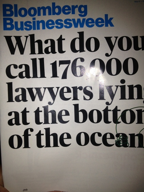
The Bloomberg Business Week magazines always catch my attention. Even though they usually have no visuals, something about the coloring and typefaces catch my eye. The magazine is extremely recognizable. Its sales base is defiantly subscription based because it is a weekly magazine. Bloomberg would struggle selling a weekly magazine in newsstands. The main cover line is large with a bold typeface that instantly draws the reader in. The date is May 13th and costs around $3.

Sarah Gaines: Post No. 5

GainesMagazine02GainesMagazine022GainesMagazine023


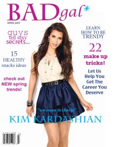
My magazine is called “bad gal” and is meant for women from the ages 18-30. I really wanted my magazine to represent a strong, successful, fashionable, happy woman. It is a fashion, health, love, career based magazine. I really wanted to make the colors and fonts appear sassy and fun, which I think I succeeded at. I also used a lot of white in my background to make sure it looked clean and not busy. My magazine is subscription based and features a different  “bad gal” every month.

Image

Sarah Gaines: Post No. 4

Sarah Gaines: Post No. 4

I really liked this magazine cover because it has one of my favorite actresses and it is an eye catching photo on the cover. I think this is probably a newsstand base sales magazine. My favorite coverline was the “600+ shoes, bags and best impulse buys” because it had the big 600 in lime green and any girl would like to see 600+ accessories. It is a monthly magazine. The magazine date is april 2013 and cost around 5$.

Clint Tucker: Post No. 4

magazine picture

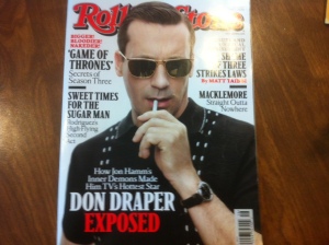
I think Rolling Stone Magazine does a fantastic job of catching their targeted audiences eye. With the plain, white background and the red and black letters: they compliment each other perfectly. There is also a good amount of spacing between the headers and the picture.It is a monthly magazine and even though I could see many people ordering this magazine, I think it is a newsstand magazine. With the bold titles and giant photos it looks like it is targeting impulse buyers. The best coverline is obviously the “Don Draper Exposed,” because it draws the most attention. The date on it is April 11, 2013. It costs $4.99.

Porter Blog Post #4

This was my favorite magazine cover because I am an avid golfer and like to keep up with what’s going on in the game. I also liked the cover because Bubba Watson, one of my favorite professional golfers and the player featured in this issue, is on the front. I believe that their target audience is more subscription-based than newsstand because one really has to know an avid amount about golf to understand this magazine. For example, the coverline that drew me in “How to Bubba Your Irons” is something only avid golfers and fans would understand. The coverline is discussing Bubba Watson, one of the longest hitters on the professional golf tour, and tips from him on how to hit it further. This was by far the coverline that drew me in, as it would any other golfer because we’re always looking for more distance. The magazine is a monthly magazine, which in this case is April 2013, a big month for the sport of golf. April is in most golfers minds the true beginning of the golf season with the Masters tournament played the second week, sending all golfers into a frenzy to want to hit the links that carries on into the summer. These issues run for $7.99.

Image

Jillian Steptoe: Blog Post No. 4

Jillian Steptoe: Blog Post No. 4

I picked this issue of Glamour magazine because it instantly caught my attention. Glamour magazine always pops out at me because they always use fun, bold colors to capture their target audience’s attention. This magazine can be found on newsstands, but readers can also subscribe to this magazine. Glamour also has titles on the cover that attract their target audience which is probably women ages 18-35. On the newsstands this magazine is $3.99 and is issued monthly. This is the May 2013 issue.

Jillian Steptoe: Blog Post No. 5


Image

ImageImageImageImage


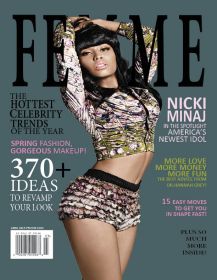
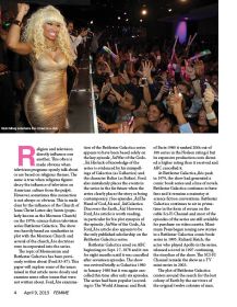
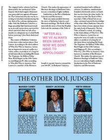
The title of magazine is Femme, which means “female” in French. This magazine targets women ages 18-35. The magazine is an entertainment magazine with a strong emphasis on fashion. I wanted to create a magazine that was informative to women, and one that was also entertaining. I wanted to use fun colors that stood out, but not too much because I did not want the magazine to look as though it was targeted one toward teens. I wanted the magazine to have a fun but sophisticated look which is why I choose black and other dark colors as well as a light pink. I used the same typefaces consistently throughout my magazine, again, to keep with a clean sophisticated look. Nicki Minaj is on the cover of this magazine. The article featuring her discusses how she has transformed from simply being a rapper into an “American Idol.” It is a perfect bound magazine. This magazine is subscription based and releases a new issue monthly, but it is also on newsstands. The competition for this magazine would be magazines such as Cosmo, Elle, Vogue and Glamour.