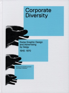
This poster for a Swiss designer’s showcase uses the Gestalt principles in perfect conjunction. The most immediately striking of these principles is that of color. As the viewer first looks at the poster, his or her eye’s are immediately attracted to the largest splash of the vibrant blue, which forces the viewer to read the headline. Next, the principle of proximity leads the viewers eyes to the left, as the viewer cannot help but notice the overlap of the black hand and color. From their, again the color takes over and causes the viewer to read the next line, and this process reoccurs for a third time. The blending of these ideas of color and proximity result in the third Gestalt principle at work, continuity. The first two principles seamlessly integrate to create a continuous path, leading the viewers eyes down the page and helping them gather all of the information. This poster is a great example of the application of Gestalt principles.
Mar
6
2013

I agree with Martin that this is a great example of Gestalt principles. The blue from the very beginning, caught my eye and was the object that I focused on the most. This is important being that the content is found within the blue boxes. Next, I noticed the continuous path as he stated, which effectively draws your eyes downward to read the points under the headline. Additionally, the proximity of the items from each other create enough white space to make the ad clean and easy to read. Overall, this is a visually stimulating ad that effectively uses Gestalt ideas in its design.