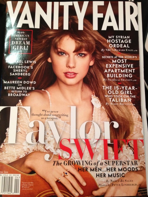
I liked the Vanity Fair magazine the most because of the dark cover photo and the way the white title and cover lines. I also like the way the red pops against the white.
I think its sales base in newsstands because of the celebrity status on the front cover and the cover lines that give you a glimpse into whats inside the magazine.
The best cover line that got me to open the magazine was the line that said “TAYLOR SWIFT. The growing of a superstar. Her men…her moods…her music.” Taylor Swift is a huge celebrity so her status was enough to get me to open the magazine.
It is a monthly magazine and the date on the magazine was April 2013. It cost $4.99.

I really like this cover. Vanity Fair does a great job of making you want to pick up and see what all is going on in their magazine with the headlines and color choices. I think it’s a great selection.
I agree with you on this. The red pops out well. The “Swift” really pops out and I like that they used the color from her lips. I think the picture isn’t that great for a cover photo because almost seems like she wasn’t ready to take it. Like maybe she was surprise or something. Overall, this was a great cover photo and the cover lines were great.